East meets West: An Exercise in Interior
 2/27/2013
 danzyudhistira
This flawlessly executed selection of interiors may seem mysteriously
miscellaneous. The collection of living, dining, bedroom and the odd
office space, is clearly influenced by competing continental styles,
such as Art Deco, Rococo, Versace and Renaissance, but they have more
than one fundamental element in common. Obvious is the precision with
which each of these interiors has been constructed, the perfect balance
achieved within, and the harmony exuded by the individual spaces. Review
of the interrelated concepts of precision and the even interchangeable:
balance and harmony, reveals a clue as to their origin. The design
philosophy central to all of these images is intrinsically linked to the
culture that produced them. They are of course, Chinese.


Unique Round Outdoor Lamp Inspired from Cute Sponge Design
 2/27/2013
 danzyudhistira
Here the unique round outdoor lamp inspired from cute sponge design. Now sponges not only could exist in the oceans, but also can be placed in the middle of your home garden. Miguel Angel García Belmonte create your outdoor lights
for round-inspired form the sponge. This light will complement your
home exterior design with a beautiful and romantic. Let’s see the picture of this unique round outdoor lamp inspired from cute sponge design at below for now.
Timeline, A Sleek and Modern Series of Kitchen Collection
 2/27/2013
 danzyudhistira
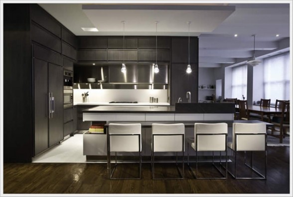
The Timeline collection marks the first collaboration of its kind between an Italian kitchen
manufacturer and an American design firm, workshop/apd. Timeline is a
sleek and modern series that will blend in well in any modern space, but
also works for traditional homes as well. Timeline is both an idea and a
project, the result of a special collaboration with the prestigious New York
design studio Workshop/apd. More than architecture, more than a trend,
more than design, more than time itself. Drawing on the history of
craftsmanship and artisans of centuries past, Matthew Berman and Andrew
Kotchen, design principals at workshop/apd, created a kitchen collection with a slightly old world look and feel for contemporary life.
Young Workspaces
 9/25/2012
 danzyudhistira
Young people take a lot of pride in the way they set up their room. Though grown-ups often feel that a child’s space should feed and nurture their creativity, curiosity, and ability to focus, the space usually ends up as one that shows off the child’s passions. As each has their own unique tastes and needs, it would be rare to find two that are alike. In this set of young workspaces we focus on a few that sport a special creative flair.
Two Distinct Styles
 9/25/2012
 danzyudhistira
Here’s a little something that we don’t see too often: two distinct
décor styles defined over the same interior space, providing two
opposing design strategies for the same room layouts
We begin with a youthful look, smoothed out in cool gray painted walls complete with huge Manga style murals.
Modern accessories flank the walls to add class to the comic art, whilst the nearby home office space remains clear, light and bright.
 RSS Feed
 Twitter


